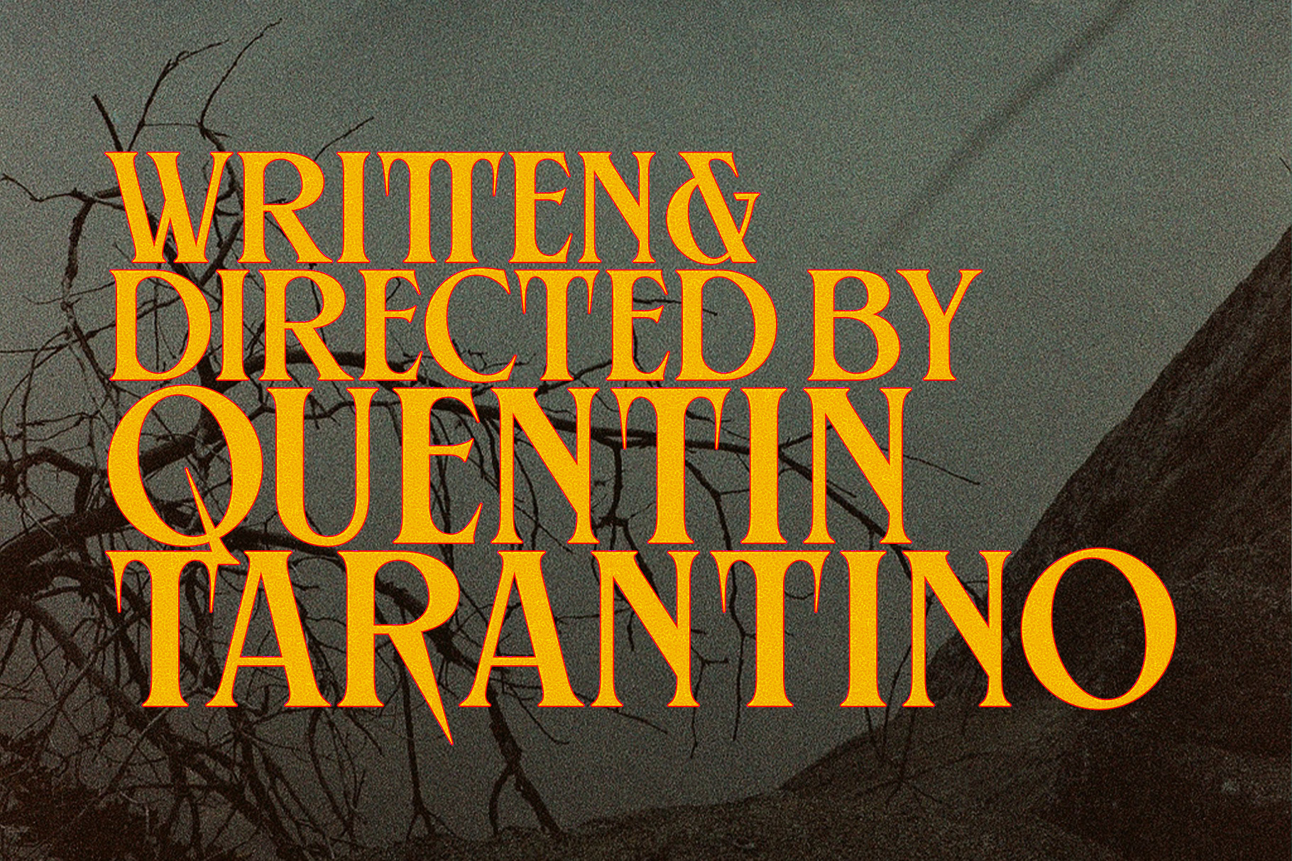
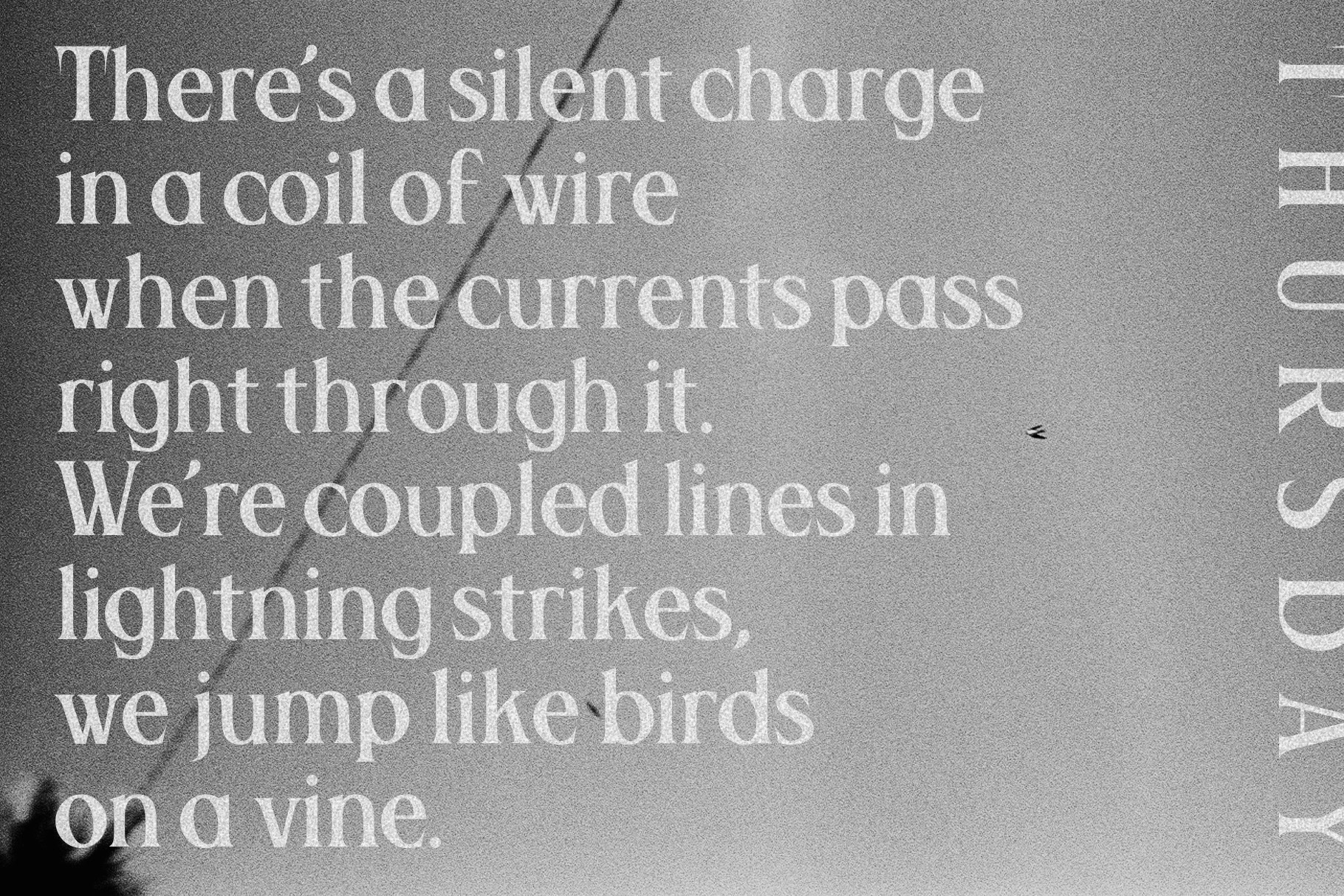
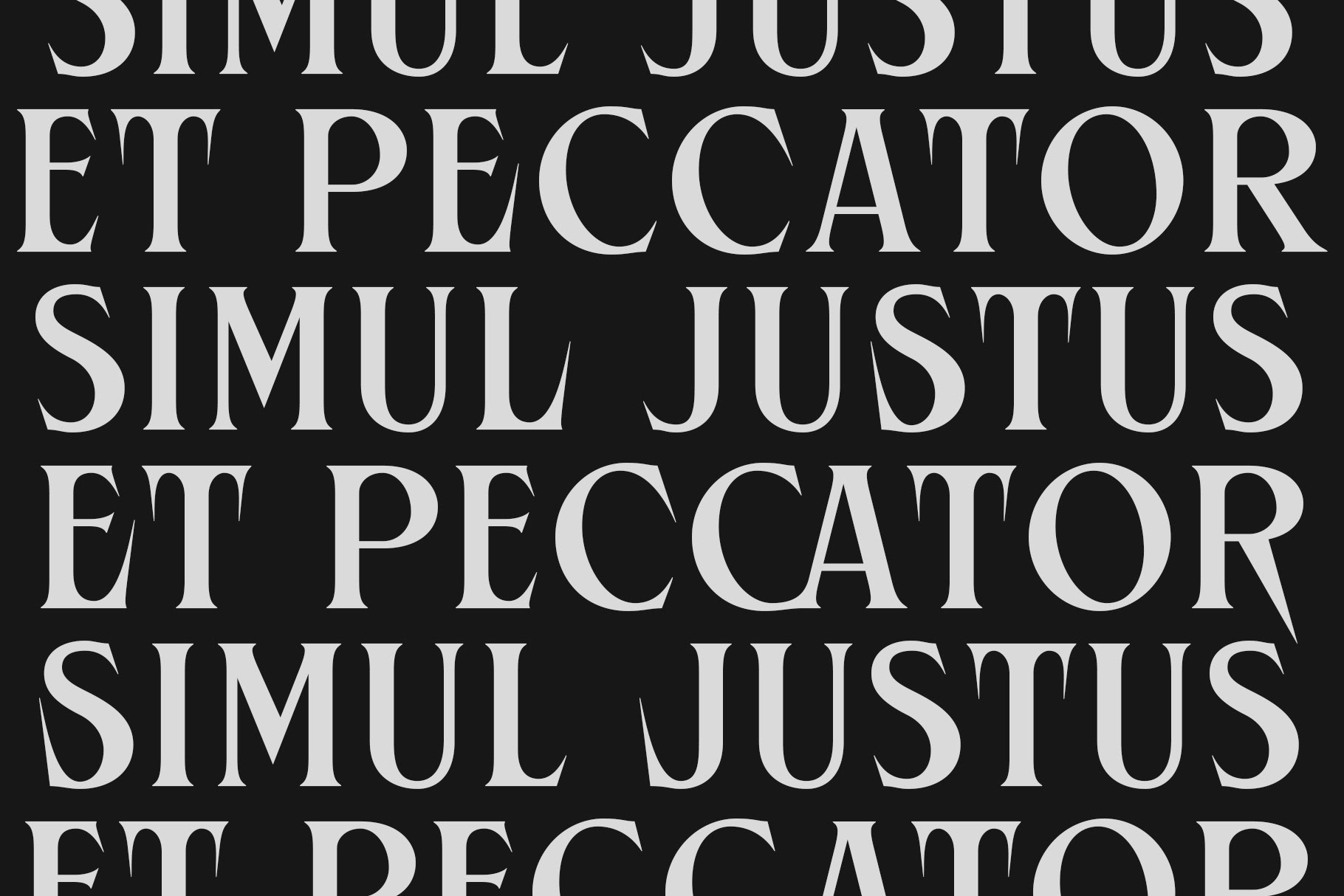
This ain’t your grandma’s serif. Lamar walks in slow, boots dusty, letterforms sharp enough to cut glass. It’s got style—real style—the kind that doesn’t ask for attention, just takes it. With slick alternates and custom ligatures tucked up its sleeve, Lamar isn’t here to play nice. It’s the serif you cast when your project needs tension, swagger, and a little danger lurking between the lines.
Classic? Sure. Predictable? Nope. Lamar brings the drama—frame by frame, glyph by glyph.


